Ephrata gets a refresh; city unveils new logo, upgrades
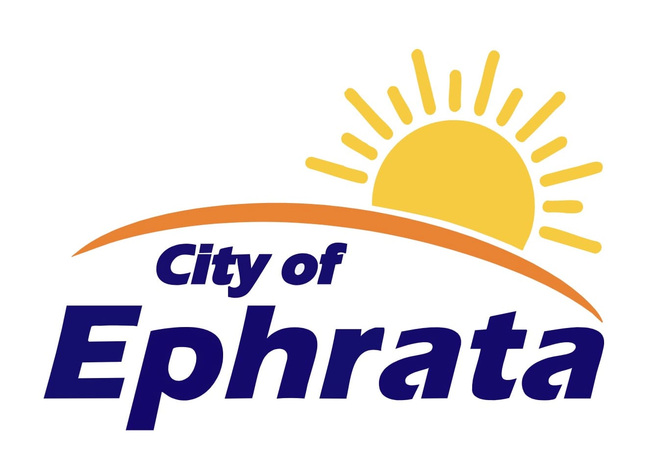
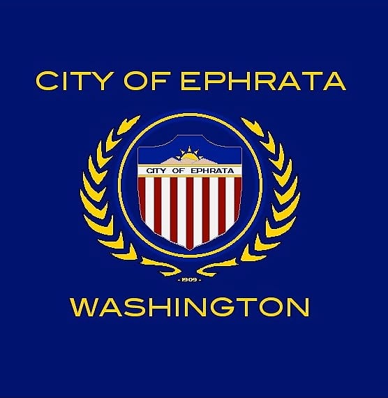
EPHRATA – Ephrata city officials last week unveiled a new logo and released information regarding a redesigned website, new mobile app, and other upgrades intended to “modernize our tools … to make it easier for residents to engage with city services.”
“For nearly two years, the City of Ephrata has been preparing for something big: a new chapter that reflects who we are today and where we’re heading tomorrow, while honoring how we got here,” the city announced in a Facebook post.
The “rebrand” announcement also referenced the community’s continuing housing growth, water system improvements with a new reservoir and booster station that will improve both volume and pressure particularly on the east side of town, and new structures and facility improvements planned for city parks.
Officials said the long-standing city seal will continue to be used for official, ceremonial, and legal documents. But the new logo is meant for “everyday visibility and brand recognition – especially when (communicating) with the public,” the announcement stated.
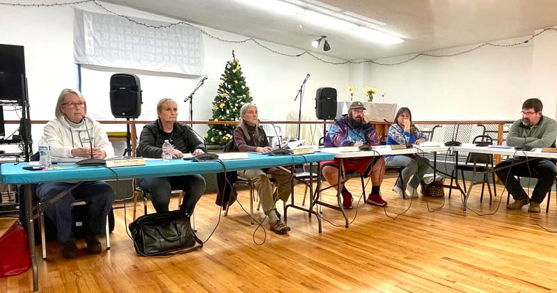
The new logo incorporates themes of “sunshine” and “hills” – which many residents identified – along with a trio of colors inspired by the community’s surrounding landscape. Last year, digital arts students at Ephrata High School shared their thoughts on “what branding means and how its shapes identity.” From there, said the city, there were multiple rounds of refinement that included feedback provided during public council meetings.
The revamped website and MyEphrata app are available for free download in both the Google Play Store and Apple App Store.
Users can continue to pay utility bills and view city updates and events online, plus submit service requests, report maintenance issues, and upload photos. Residents can also sign up for alerts via email or text on various topics with the “Notify Me” option.
“These tools are about more than convenience,” the announcement stated. “They’re about making your government more accessible, transparent, and responsive.”
